Resize Image for Instagram, X & LinkedIn: 2026 Cheatsheet
The exact image dimensions for every Instagram, X, and LinkedIn placement in 2026 — feed, story, header, banner, profile — plus a one-click resize workflow.
Resize Image for Instagram, X & LinkedIn: A 2026 Cheatsheet
Every social platform decided on its own ideal image size, then changed it twice between 2020 and 2026. The result: a single product photo needs four sizes for Instagram, three for X, and two for LinkedIn before it ships. This is the 2026 cheatsheet for resizing one image for Instagram, X, and LinkedIn — exact pixel dimensions, the aspect-ratio traps, and a 30-second browser workflow that cuts manual cropping out of the loop.
TL;DR
- Instagram square posts are 1080×1080 px; portrait 1080×1350; story and reel 1080×1920 (9:16).
- X feed images render at 1600×900 max; the header is 1500×500 with strict crop zones for desktop and mobile.
- LinkedIn personal banners are 1584×396; company banners are 1128×191 — never interchange them.
- Always resize from the largest source and export to JPG or WebP for photos, PNG only for flat colour.
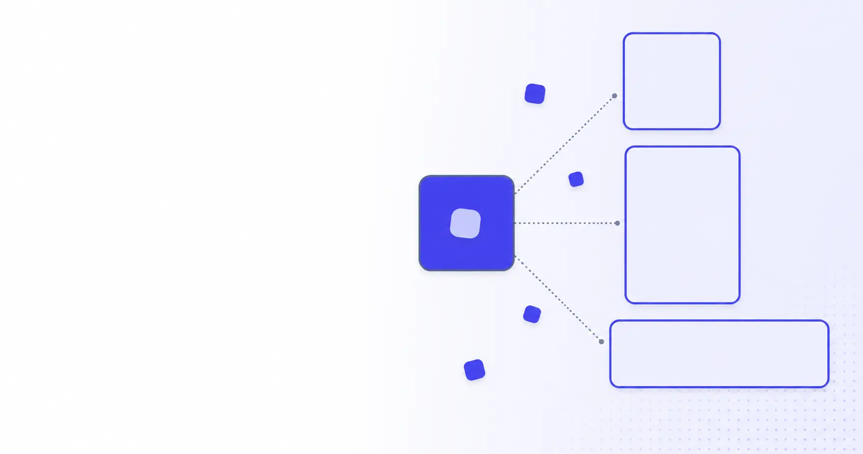
- A presets-based resizer like iKit Image Resizer generates every platform size from one upload in under a minute.
The 2026 social-media size cheatsheet
Print this section, pin it next to your monitor, and stop Googling "Instagram story size" for the rest of the year. Every value below was verified against the platforms' published creator guidelines as of May 2026.
Instagram: feed, story, reel, profile
Instagram's feed today serves four placement types from a single upload — but only if the source is at least 1080 px on the short edge. Anything smaller and the platform applies bicubic upscaling, which softens text and adds halos around saturated colours.
| Placement | Pixels | Aspect Ratio | Notes |
|---|---|---|---|
| Feed (square) | 1080 × 1080 | 1:1 | Safe for grid + feed |
| Feed (portrait) | 1080 × 1350 | 4:5 | Most vertical real estate |
| Feed (landscape) | 1080 × 566 | 1.91:1 | Avoid — cropped on the grid |
| Story / Reel | 1080 × 1920 | 9:16 | 250 px top + bottom = UI safe-zone |
| Profile photo | 320 × 320 | 1:1 | Rendered at 110 px on mobile |
The portrait 4:5 placement gets the most pixels above the fold on a mobile feed and consistently outperforms square posts on engagement-rate dashboards. Instagram documents its supported aspect ratios and upload limits in the official Instagram Help Centre, which is worth re-checking before a major campaign. Use it as the default unless the brand template demands a square crop.
X (formerly Twitter): post, header, profile
X feed images are width-bound, not height-bound — the platform crops anything taller than 9:16 to a card-style preview that hides everything below the first ~600 px on desktop. For inline images, design to 16:9 and you will rarely see your composition truncated.
| Placement | Pixels | Aspect Ratio | Notes |
|---|---|---|---|
| Feed image | 1600 × 900 | 16:9 | Crop preview ≈ top 504 px |
| Header image | 1500 × 500 | 3:1 | Avatar overlaps lower-left 200 px |
| Profile photo | 400 × 400 | 1:1 | Rendered at 48 px in feed |
| Card image | 1200 × 628 | 1.91:1 | OpenGraph default |
The header has two cropping disasters most people hit on the first try: the avatar overlap on the lower-left and the mobile-view crop that hides the leftmost 100 px. Build a 1500×500 header with the centred 1300×400 region holding everything you need readable.
LinkedIn: personal, company, post
LinkedIn distinguishes personal banners (wider, taller, more dramatic) from company banners (much narrower) — and uploading the wrong one is one of the most common bug reports the platform's help centre receives.
| Placement | Pixels | Aspect Ratio | Notes |
|---|---|---|---|
| Personal banner | 1584 × 396 | 4:1 | Avatar covers lower-left 240 px |
| Company banner | 1128 × 191 | ~5.9:1 | Logo overlaps lower-left 200 px |
| Post image (single) | 1200 × 628 | 1.91:1 | Same OG default as X |
| Post image (square) | 1200 × 1200 | 1:1 | Best engagement on mobile |
| Profile photo | 400 × 400 | 1:1 | Rendered at 152 px on profile |
If you maintain both a personal page and a company page, generate both banner sizes from the same source — never stretch the personal banner to fit the company slot.
Why correct dimensions still matter in 2026
Platforms accept almost any image you throw at them. The reason to care about exact pixel dimensions in 2026 has shifted from "the upload will fail" to "you'll never see what you actually uploaded".
Auto-crop kills your composition
Every major platform now applies an algorithmic crop to oversized or off-ratio uploads. Instagram pulls the centre region; X uses a saliency model that biases toward faces; LinkedIn does a top-weighted square crop. None of them ask first. Your beautifully composed wide shot becomes a centred close-up nobody asked for. Correct-ratio uploads bypass the cropper entirely.
Compression artifacts compound after re-upload
Each platform re-encodes uploaded images as JPEG (or WebP, on newer Instagram and LinkedIn paths) at quality factors between 75 and 85. Re-uploading an already-compressed image is a generation-loss process — every pass adds blocking artifacts around high-contrast edges. The fix is to keep one master at the largest required dimension and export each platform variant from the master, never from another platform's output.
If you also need to bring file sizes down before upload, the iKit Image Compressor gives you visual quality control rather than a fixed algorithm — pair it with the resizer for a clean two-step workflow. We covered the photo-quality side of this in detail in the PNG compression guide.
Mobile-first display makes the wrong aspect ratio worse
In 2026, more than 90% of social impressions render on a mobile screen narrower than 480 CSS pixels. A 4:5 portrait gets the same vertical space on mobile as a square does on desktop, but a 1.91:1 landscape collapses to a sliver. Designing for mobile-first ratios is no longer optional — it is the default, and the desktop view is the secondary case.
Resizing without losing visible quality
Resize is a destructive operation. The pixels you started with are not the pixels you end with. Three small choices decide whether your output looks crisp or washed-out.
Pick the right resampling algorithm
For downscaling, Lanczos (also called Lanczos-3) is the default in any tool worth using — it gives the sharpest output without ringing artifacts. Bicubic is acceptable but softer. Nearest-neighbour is correct only for pixel-art and screenshots of UI elements; for photos it produces visible jaggies. The MDN guide on responsive images covers the trade-offs in more depth, including how browsers themselves resample on display.
Match aspect ratio first, then crop
The two-pass workflow — first crop the source to the target aspect ratio, then resize to the target pixel dimensions — produces measurably sharper output than a single resize that distorts the geometry. Most browser-based tools (including iKit's) do this in one click when you pick a preset; if you script the pipeline yourself, separate the steps.
Strip metadata before upload
Photos out of phones carry EXIF metadata: GPS coordinates, camera model, sometimes the photographer's name. Most platforms strip it on their servers, but not all of them, and the strip happens after the upload — meaning your unredacted file briefly lives in their logs. Strip locally before upload. The iKit Background Remover and the resizer both drop EXIF by default; if you keep a desktop ImageMagick pipeline, add -strip to the command.
A 30-second, one-source workflow
The full workflow for shipping one image across Instagram, X, and LinkedIn in under a minute starts the same way browsers do — serve the right size for the target.
<picture>
  <source
    media="(max-width: 480px)"
    srcset="hero-1080.webp">
  <source
    media="(min-width: 481px)"
    srcset="hero-1600.webp">
  <img src="hero-1600.jpg"
       alt="Hero image">
</picture>
The <picture> element above shows the same idea browsers use natively: serve the right size for the viewport. On social platforms you do this manually by uploading the right preset for each placement.
Step 1 — start with the largest clean source
Photograph or export at the largest dimension you'll ever need — currently 1920 px on the long edge for Instagram reels. Anything you can downscale from there will look better than anything you upscale from a 1080 px source.
Step 2 — generate every preset in one pass
Open the iKit Image Resizer, drop the source, pick the social-media presets you need (Instagram square, story, reel, X header, X feed, LinkedIn banner, LinkedIn post), and download the bundle. The tool runs entirely in your browser — your source never leaves the tab. If you also need to bundle the outputs as a single zip to email to a designer, the same in-browser pattern is documented in the bulk ZIP workflow post.
Step 3 — quick-check on a fake feed
Before publishing, drop the output into a CSS placeholder that mimics the platform's aspect ratio:
.feed-card {
  aspect-ratio: 4 / 5;
  width: 100%;
  max-width: 480px;
  object-fit: cover;
  object-position: center;
}
This is the cheapest preview you can build — no platform sandbox required, and it catches off-centre subjects before they ship.
When the cheatsheet is wrong
The cheatsheet above is correct for May 2026. Two things invalidate it: the platform changes specs, or your brand template overrides them.
When the platform updates specs
Instagram pushed a portrait-feed default in 2024 and a 9:16 reel-grid update in late 2025; X reverted card crops twice in 18 months. Bookmark the platform's creator help centre and re-check before any major campaign. As a baseline, the platforms publish the canonical numbers in three places worth keeping pinned: Instagram Help Centre lists current upload limits per placement, the X developer docs cover OpenGraph card sizing, and LinkedIn marketing solutions docs document banner safe-zones.
When a brand template overrides
If your brand book mandates a centred square logo lockup, the cheatsheet's "use 4:5 by default" advice does not apply — ship the square. The cheatsheet describes the platform's preferred behaviour; brand templates describe yours, and yours wins inside the design system you've committed to.
When transparency or motion is required
PNG transparency is preserved by Instagram on stories but flattened on feed posts. For motion, the recommended formats are MP4 (H.264, AAC, ≤4 GB) for reels and MP4 or GIF for X — image resizers do not help here. If your asset needs a clean cutout for transparency, run it through the iKit Background Remover first, then resize the trimmed PNG to the target placement.
References
- Image resolution of photos you share on Instagram — Instagram Help — Instagram's official upload-resolution guidance (up to 1080 px wide).
- Reel size & aspect ratios on Instagram — Instagram Help — Official reel sizing and aspect-ratio reference.
- How to upload X profile photos and headers and best sizes — X Help — X's official header recommendation of 1500×500 pixels.
- Image specifications for your LinkedIn Pages and Career Pages — LinkedIn Help — LinkedIn's published cover, logo, and module image specs.
- Responsive images — MDN — Background on resampling and the picture element used in the workflow.
Related on iKit
- Compress Images to a ZIP, Free — the same browser-only batching pattern used here for resize, applied to compression and zip-bundling for designer hand-off.
- Compress PNG Without Losing Quality — pair with this resize cheatsheet to keep file sizes inside platform upload caps without softening the result.
- Remove Image Background Without Photoshop — cut a clean transparent subject before resizing, ideal for stories and product placements that need no backdrop.
Related posts
Diff Checker Online: Compare Any Two Texts Fast (2026)
A diff checker compares any two texts in seconds, right in your browser — no upload, no sign-up. Learn how diff algorithms work and when to use one.
Regex Cheatsheet 2026: 25 Patterns You'll Use Every Week
A practical regex cheatsheet for 2026: 25 ready-to-paste patterns for emails, URLs, dates, and log parsing, plus the syntax rules behind them.
Convert Images to AVIF — and When AVIF Beats WebP (2026)
Learn how to convert images to AVIF in the browser, when AVIF beats WebP on file size, and how to ship it safely with a WebP and JPG fallback in 2026.