Mipmap Generator for Android: 5 Density Folders, One Click (2026)
Free online mipmap generator — turn one source PNG into every Android density (mdpi → xxxhdpi) plus adaptive icons, ready as a drop-in res/ folder. No Android Studio, no upload.
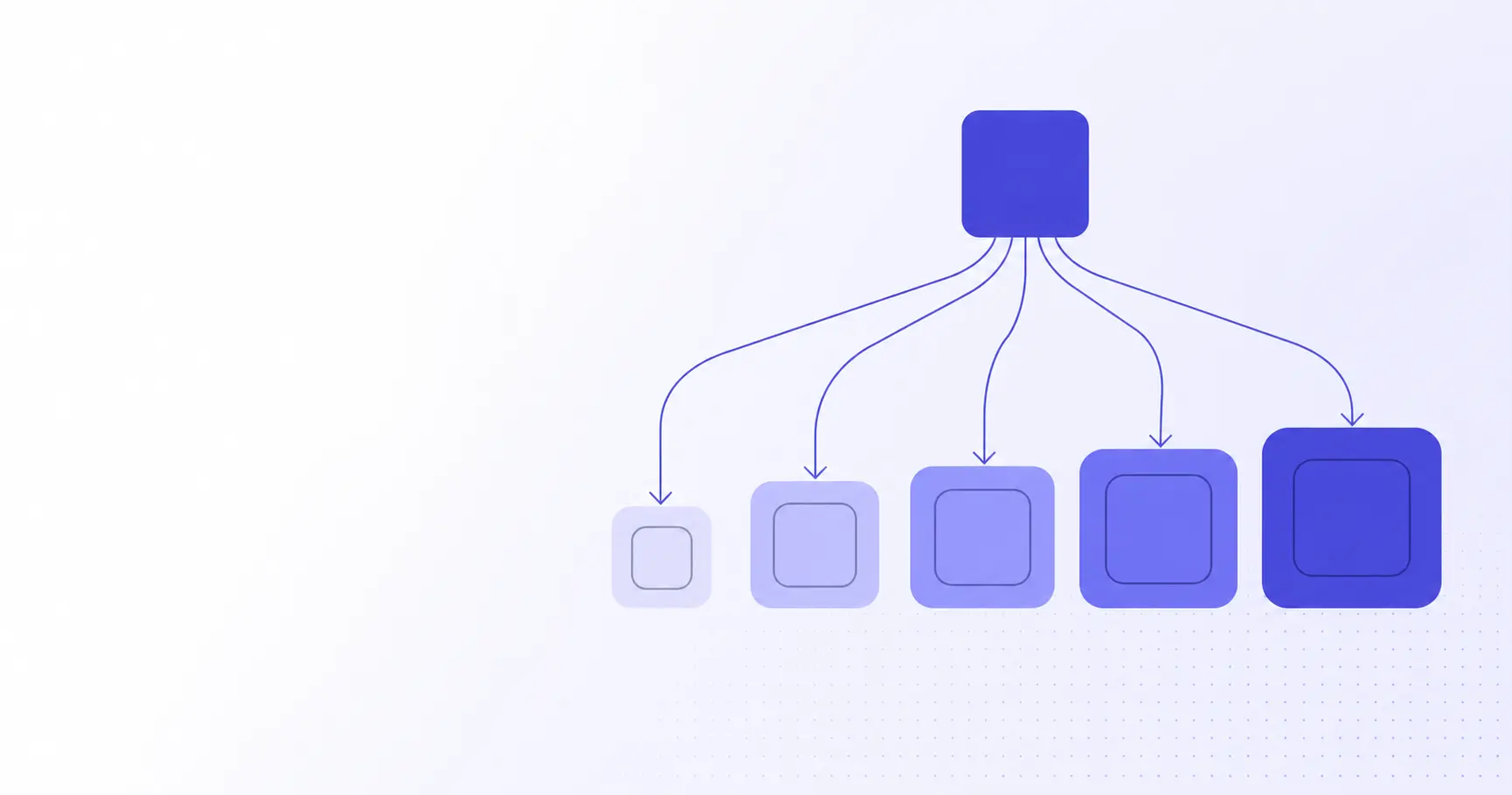
Mipmap Generator: 5 Android Density Folders, One Click
Looking for a free mipmap generator? Shipping an Android app means producing your launcher icon at five distinct screen densities — mdpi, hdpi, xhdpi, xxhdpi, xxxhdpi — and dropping each variant into the right res/mipmap-* folder. Add adaptive icons (foreground + background per density) and you're looking at a dozen PNGs and an XML resource per app. iKit's mipmap generator collapses that into one export from a single 1024×1024 source — no Android Studio, no upload.
TL;DR
- Android mipmap folders hold launcher icons at five densities: mdpi → xxxhdpi.
- Standard sizes are 48, 72, 96, 144, and 192 px square (legacy bitmaps).
- Adaptive icons add a 108 dp foreground + background pair per density.
- iKit's generator produces every PNG plus
ic_launcher.xmlfrom one source. - Everything runs in the browser — no Android Studio, no upload, no sign-up.
Why mipmap, not drawable?
For years, Android developers shipped launcher icons in res/drawable-* folders alongside other UI bitmaps. The Android team moved them to res/mipmap-* in API level 21 (Lollipop) for one practical reason: launchers commonly display the icon at a higher density than the device's native bucket.
The mipmap vs drawable distinction
The build tool strips unused density variants from a drawable resource at APK packaging time. So if you compile for an xhdpi-only device variant, the build keeps drawable-xhdpi/ic_launcher.png and discards the rest. That's fine for a button — but launchers like Pixel Launcher upscale icons to 125% on certain UI surfaces, and stripping the higher-density bitmap means the upscale comes from a smaller source.
Mipmap resources are exempt from that density stripping. Every icon variant ships in the APK regardless of the device's bucket. That's the whole reason the bucket exists.
Why launchers want mipmaps even at non-native densities
Google's official guidance is explicit: place launcher icons in mipmap folders so the system can pick the next-higher density when upscaling. A Pixel 7a runs at xxhdpi (~480 dpi), but Android may load the xxxhdpi variant for the All Apps grid to keep edges crisp at 192×192 px. If only the xxhdpi version is in the APK, you get a 1.33× scale from 144 px — visibly mushy on AMOLED displays.
How density buckets map to devices
| Bucket | DPI | Pixel size | Typical device class |
|---|---|---|---|
| mdpi | ~160 | 48×48 | Low-end Android Go, older 7" tablets |
| hdpi | ~240 | 72×72 | Older budget phones |
| xhdpi | ~320 | 96×96 | Many tablets, mid-range phones |
| xxhdpi | ~480 | 144×144 | Pixel 7/8, Galaxy S series |
| xxxhdpi | ~640 | 192×192 | Galaxy S24 Ultra, Pixel 8 Pro |
The numbers aren't arbitrary — they're a 1.5× / 2× / 3× / 4× geometric progression from a 48 dp baseline. Each pixel size is 48 dp × scale factor.
The 5 mipmap density folders explained
Open any modern Android Studio project and you'll see this canonical layout:
app/src/main/res/
├── mipmap-mdpi/
│   ├── ic_launcher.png        (48×48)
│   └── ic_launcher_round.png  (48×48)
├── mipmap-hdpi/
│   ├── ic_launcher.png        (72×72)
│   └── ic_launcher_round.png  (72×72)
├── mipmap-xhdpi/
│   ├── ic_launcher.png        (96×96)
│   └── ic_launcher_round.png  (96×96)
├── mipmap-xxhdpi/
│   ├── ic_launcher.png        (144×144)
│   └── ic_launcher_round.png  (144×144)
└── mipmap-xxxhdpi/
    ├── ic_launcher.png        (192×192)
    └── ic_launcher_round.png  (192×192)
mdpi: the 48×48 baseline
mdpi is the reference density. Everything else is a multiple of it. If you've never sized an icon for Android before, start by asking "does this read at 48×48?" — if it doesn't, no amount of resampling at higher density will save it. Tiny icons need tighter stroke weights, punchier contrast, and sometimes a different composition; details that vanish at 48 px should be removed in the master, not patched per-bucket.
hdpi through mipmap-xxxhdpi: the multipliers
The four higher buckets are simple scale factors of the mdpi baseline:
- hdpi = 1.5× mdpi → 72×72
- xhdpi = 2× mdpi → 96×96
- xxhdpi = 3× mdpi → 144×144
- xxxhdpi = 4× mdpi → 192×192
A common misconception: ship only xxxhdpi (192) and let Android downsample at runtime. In practice it does — but a Lanczos-3 downsample of a 192 px master to 48 px is noticeably softer than a cleanly resampled 48 px source. For app icons in particular, where a few pixels of stroke weight make or break legibility, ship all five buckets.
A quick density math primer
In Kotlin you can convert dp to px on a running device:
val density = resources.displayMetrics.density
val px48 = (48 * density).toInt()
// Pixel 7 Pro (xxxhdpi): density = 4.0 → 192 px
// Pixel 7 (xxhdpi):      density = 3.0 → 144 px
// Galaxy Tab (xhdpi):    density = 2.0 →  96 px
That density value is what tells the launcher which mipmap bucket to load — and why you want every bucket present in the APK.
Adaptive icons — when one bitmap isn't enough
Android 8.0 (Oreo) introduced adaptive icons, splitting the launcher icon into a foreground layer and a background layer. The launcher applies a system-defined mask — circle on Pixel Launcher, squircle on OnePlus, teardrop on some OEM skins — so the same icon renders consistently across launchers.
Foreground + background layers
Each layer is a 108×108 dp bitmap (or vector). The visible safe area is only the inner 66×66 dp region. The outer 18 dp on each side is reserved for parallax animation and OEM masking. If your foreground touches the canvas edge, it'll be clipped on most circle-mask launchers.
| Density | Adaptive layer (px) | Legacy bitmap (px) |
|---|---|---|
| mdpi | 108×108 | 48×48 |
| hdpi | 162×162 | 72×72 |
| xhdpi | 216×216 | 96×96 |
| xxhdpi | 324×324 | 144×144 |
| xxxhdpi | 432×432 | 192×192 |
ic_launcher.xml — anatomy of the adaptive resource
The adaptive icon itself isn't a bitmap; it's a tiny XML resource living in res/mipmap-anydpi-v26/:
<?xml version="1.0" encoding="utf-8"?>
<adaptive-icon
  xmlns:android="http://schemas.android.com/apk/res/android">
  <background
    android:drawable="@drawable/ic_launcher_background"/>
  <foreground
    android:drawable="@drawable/ic_launcher_foreground"/>
  <monochrome
    android:drawable="@drawable/ic_launcher_monochrome"/>
</adaptive-icon>
The <monochrome> element, added in Android 13 (API 33), is what powers themed icons — the launcher tints a single-color silhouette to match the user's wallpaper. Skip it and your icon falls back to the foreground/background pair on themed-icon launchers, which looks inconsistent next to themed system apps.
Why the inner 66 dp matters
A logo that fills the full 108×108 canvas will look correct on a square-mask launcher and lose its corners on a circle-mask launcher. Designers experienced with adaptive icons effectively design at 66 dp and let the outer ring be "bleed" — the same way print designers add 3 mm of trim margin to a business card.
The 30-second iKit mipmap generator workflow
iKit's App Icon Generator treats the Android export as a one-click operation. It runs entirely in your browser using WebAssembly — your source PNG never leaves your device.
Drop a 1024×1024 source
The recommended master is the same 1024×1024 sRGB PNG you'd use for App Store Connect: full-bleed, no rounded corners, no transparency. iKit's Lanczos-3 downsampler produces sharper small-density output than the bicubic filter most generators rely on. If your source isn't already a clean square, run it through iKit's image resizer first to crop and rescale to 1024×1024 before generating — the generator assumes a square master and will distort otherwise.
What gets generated
Pick "Android" from the platform selector and you get:
mipmap-mdpi/ic_launcher.png(48×48)mipmap-hdpi/ic_launcher.png(72×72)mipmap-xhdpi/ic_launcher.png(96×96)mipmap-xxhdpi/ic_launcher.png(144×144)mipmap-xxxhdpi/ic_launcher.png(192×192)- The matching
ic_launcher_round.pngset for legacy circle launchers - Adaptive
ic_launcher_foreground.pngat all five densities - An
ic_launcher.xmladaptive-icon resource formipmap-anydpi-v26/
The export is a single ZIP that mirrors the res/ folder structure exactly. Unpack it on top of app/src/main/res/ and your build is done.
Drop straight into res/
The bundled folder layout means you can extract directly into your project tree:
unzip ikit-android-icons.zip \
  -d app/src/main/res/
./gradlew assembleDebug
No copy-pasting from a generator preview, no manual file-renaming, no playing density-bucket bingo at 11 pm before a release.
Common pitfalls
A few details that trip up even experienced Android engineers:
Edges clipping under adaptive masks
If your design has a visible border or boundary near the edge of the 108 canvas, it'll disappear on circle-mask launchers and look fine on square-mask launchers. The fix is to design within the inner 66 dp safe zone and treat the outer ring as breathing room. Test your foreground at three masks — circle, squircle, and rounded square — before exporting.
PNG-8 vs PNG-24 in the bundle
Some legacy generators output PNG-8 with an indexed palette to keep file sizes down. That's fine for solid-color logos but introduces visible dithering on gradients. iKit emits PNG-24 with optimized DEFLATE compression — typically 8–12 KB per icon, which is small enough that palette quantization is an unnecessary trade-off. If you need to shrink the bundle further, run the output through iKit's PNG compressor for an extra 30–40% reduction without quality loss.
Forgetting the legacy fallback
Devices on Android 7.1 or older don't understand adaptive icons — they fall back to the static ic_launcher.png and ic_launcher_round.png bitmaps. If you only ship the adaptive XML, the launcher displays a generic gray square on the small but real share of devices still on legacy Android. Always include the legacy bitmap pair in every density folder. iKit's generator does this for you by default.
Resizing in the wrong color space
Android renders icons in sRGB. If your source PNG carries a P3 or Adobe RGB profile, the launcher treats the embedded values as sRGB and your colors will shift visibly — usually toward a slightly washed-out look. Strip the color profile or convert to sRGB before generating. Modern design tools default to sRGB on export, but designer hand-offs from Photoshop sometimes carry P3 baked in, so it's worth checking with file ic_launcher.png or a metadata viewer.
References
- Adaptive icons | Views | Android Developers — Official spec for 108 dp adaptive layers, 66 dp safe zone, and the monochrome themed-icon layer.
- Support different pixel densities | Android Developers — Source for the mdpi/hdpi/xhdpi/xxhdpi/xxxhdpi DPI buckets and 3:4:6:8:12:16 scale ratios.
- Adaptive icons | Jetpack Compose | Android Developers — Confirms the inner 66×66 dp masked viewport and the 18 dp outer reserve on each side.
- Designing Adaptive Icons — Google Design — Nick Butcher's original write-up explaining adaptive icons introduced in Android 8.0 (Oreo).
Related on iKit
- Generate App Icons for iOS, Android & Web — The companion guide that covers the full cross-platform matrix beyond Android, including the iOS Asset Catalog and PWA maskable icons.
- iOS App Icon 1024×1024 Generator — The iOS counterpart: same 1024×1024 source, output as an Xcode
AppIcon.appiconsetwith a validContents.json. - Apple Touch Icon: Sizes & Specs — The web-side companion for the 180×180 PNG iOS Safari pins to the Home Screen.
- Appicon.co Alternative: iKit App Icon Generator — How iKit's browser-only generator compares to appicon.co on privacy, output coverage, and speed.
- Compress PNG without losing quality in 2026 — Once your mipmap bundle is ready, this walk-through shows how to shrink the launcher icons another 30–40% before committing them to your APK, without visible artifacts.
Related posts
How to Test a Regex Pattern Online in 30 Seconds (2026)
Learn how to test a regex pattern online without writing code: paste, highlight, and debug matches, plus why the same regex passes in Python but fails in JS.
Convert a Date to Unix Timestamp: Bash, Python, JS, SQL (2026)
Convert any date to a Unix timestamp in Bash, Python, JavaScript, and SQL with copy-paste one-liners — plus the timezone trap each language hides.
Convert PNG to WebP and Cut Image Size by 30% (2026)
Convert PNG to WebP to cut image size by roughly 30% with no visible quality loss. A 2026 guide to lossless vs lossy, the Canvas API, and browser support.